

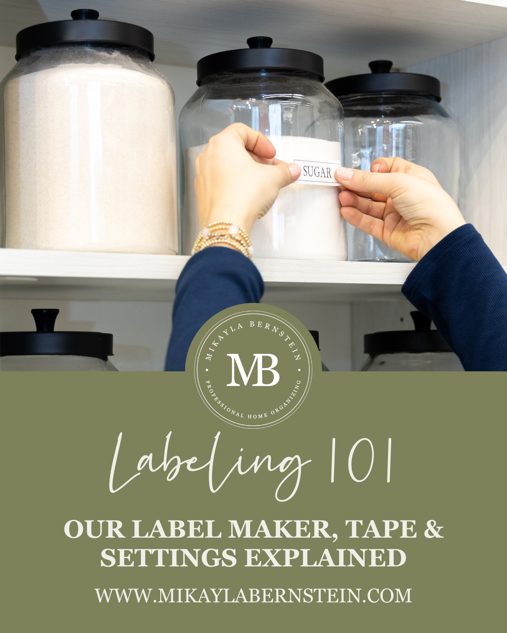
Labeling 101: Our Label Maker, Tape & Settings Explained
If you’ve ever looked closely at our pantry, closet, or storage labels and wondered, “How did they make those?” or if you’re a client thinking, “Okay, how do I change these later?” you’re not alone.
We get this question all the time, so we’re breaking down all of our label making tips and tricks.
Whether you’re organizing your pantry, linen closet, or kids’ storage, this setup is simple and easy to replicate at home.
Our Go-To Label Maker
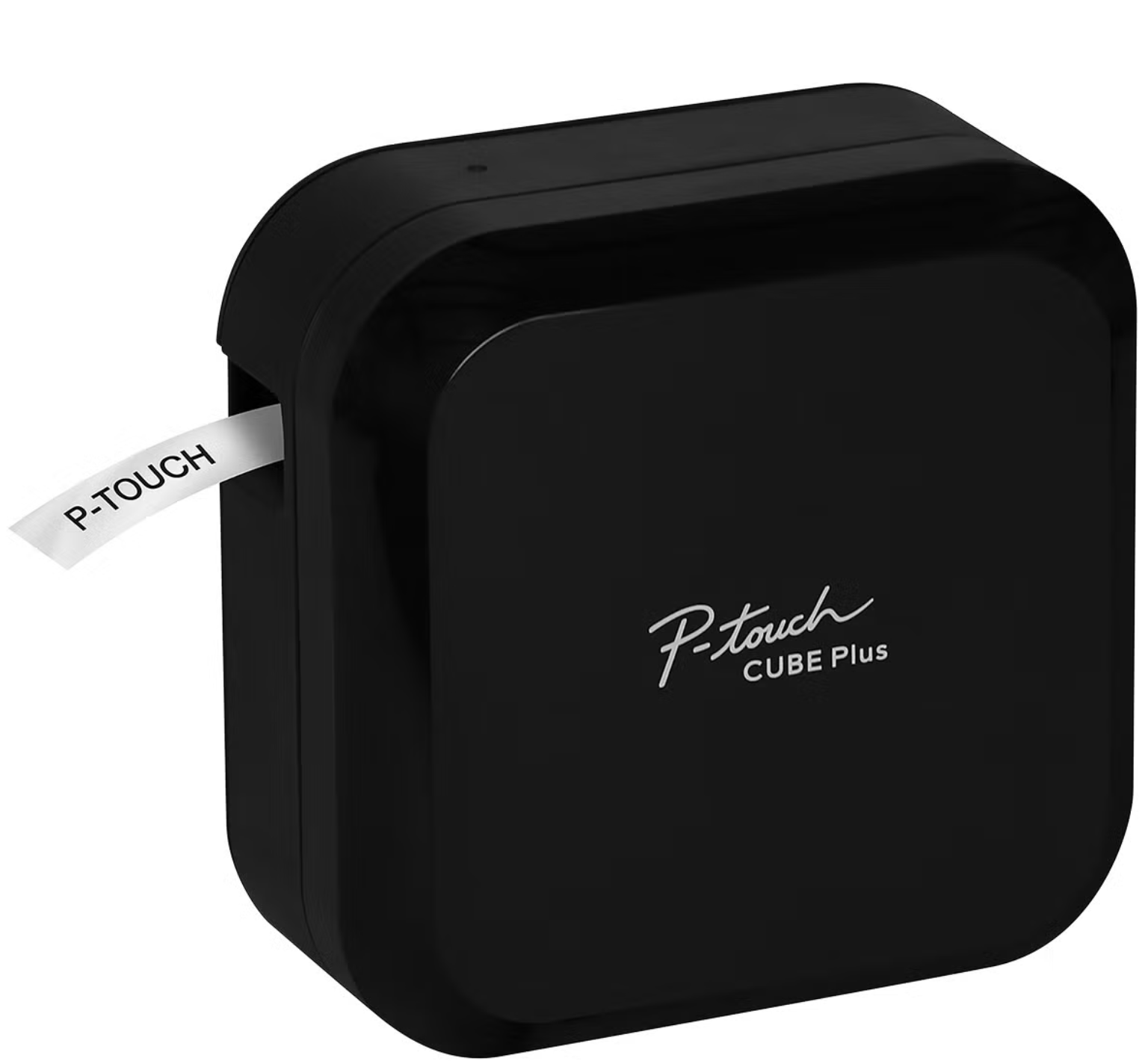
We primarily use the Brother P-Touch Cube Plus Label Maker.
Why we love it:
Clean, professional-looking labels
Easy to customize spacing, font size, and margins
Easy-to-use app that connects via Bluetooth
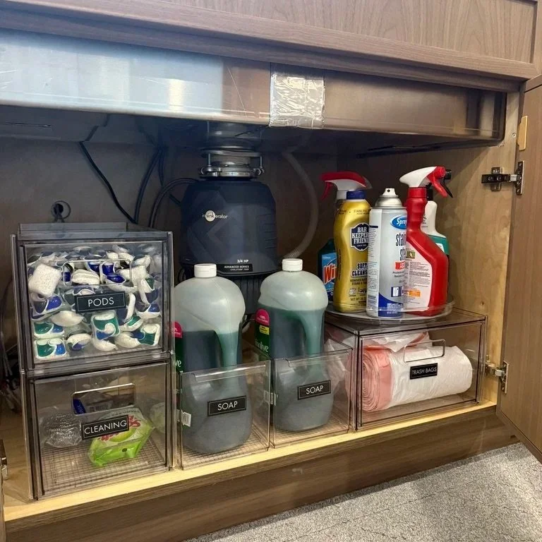
The Label Tape We Use Most Often
For most projects, we use 1-inch label tape, technically 0.94 inches or 24 mm. For smaller labels, such as inside drawers, we use ½-inch tape, or 12 mm.
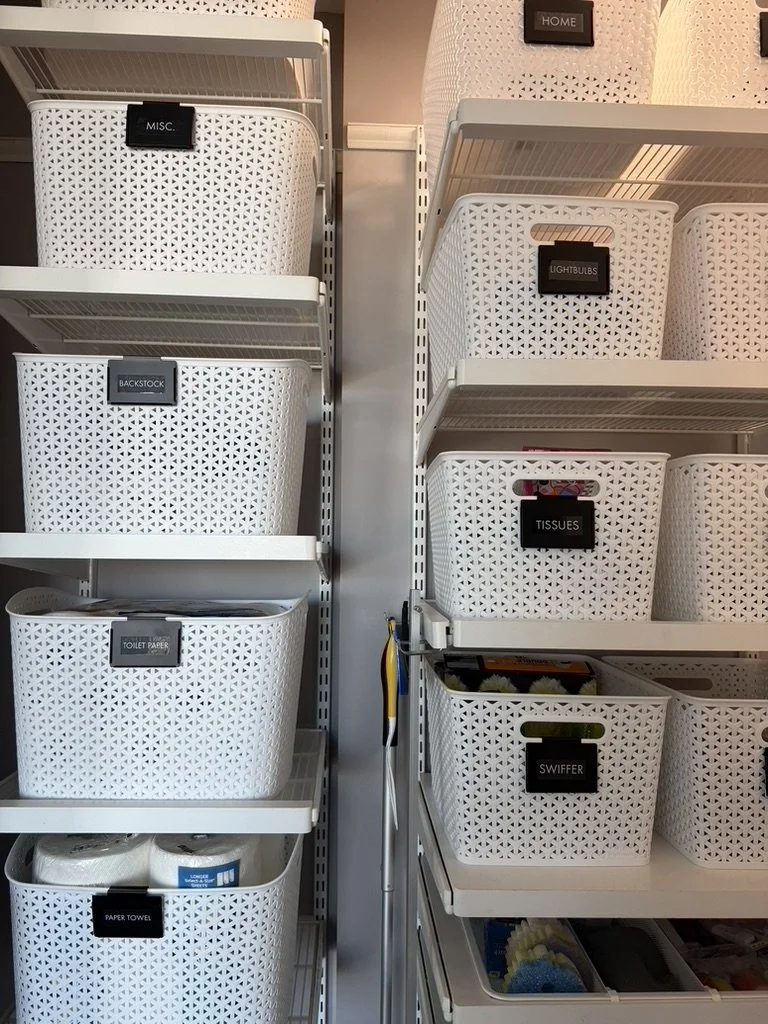
1” White on Black | Font: Futura T | Frame: Simple 1 | Length: 2.5”
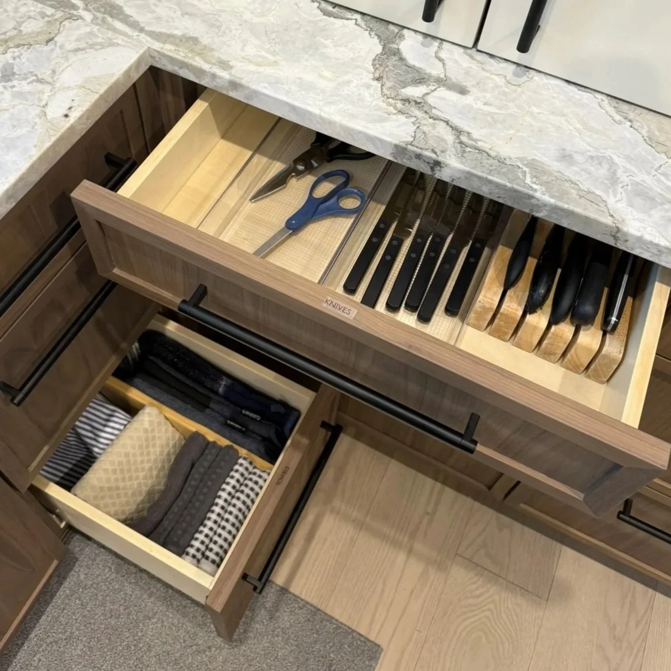
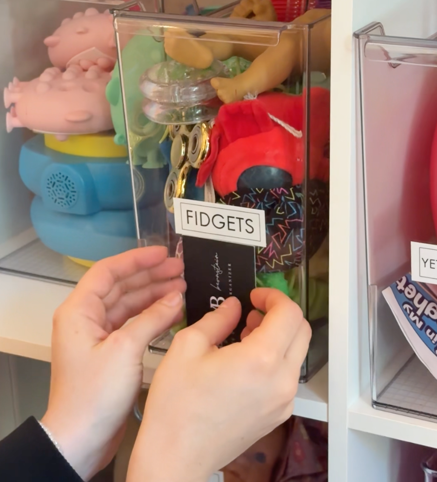
½ Black on Clear | Font: Futura T | Frame: None | Length: Off
Our Typical Settings
A big part of why our labels look consistent from project to project comes down to settings. Below are the settings we use most often.
1. Download App
Download the most current version of the Brother P-Touch Design & Print App.
2. Set Up Labels
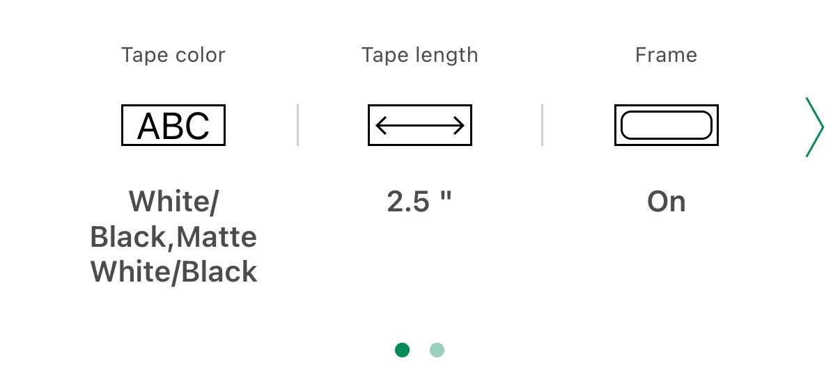
Tape Color: Automatically updated by the app. When using off-brand label tape, the color may not adjust correctly, but the labels will still print correctly.
Tape Length: We find 2.5 inches to be the ideal label length. We only adjust this setting when printing on clear tape or when labeling drawers and want the font size to remain consistent.
Frame: We typically use None or Simple 1 (top right option) for a clean, streamlined look.
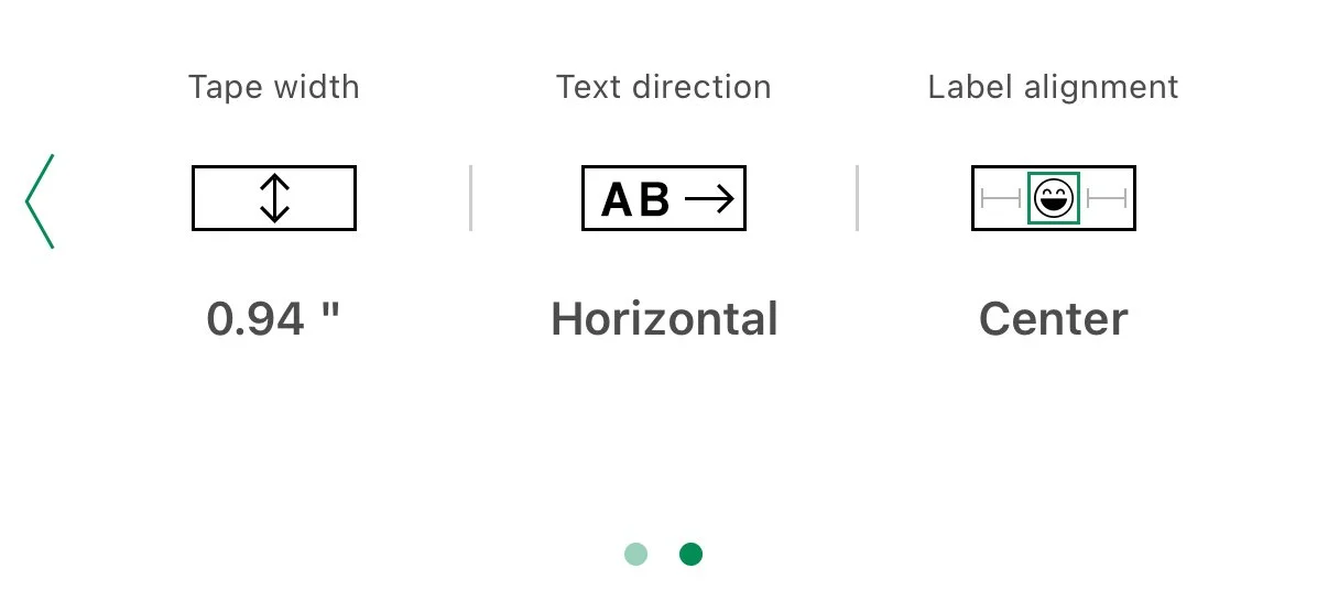
Tape Width: Corrects to label tape size.
Text Direction: Horizontal
Label Alignment: Center
3. Edit Label Text
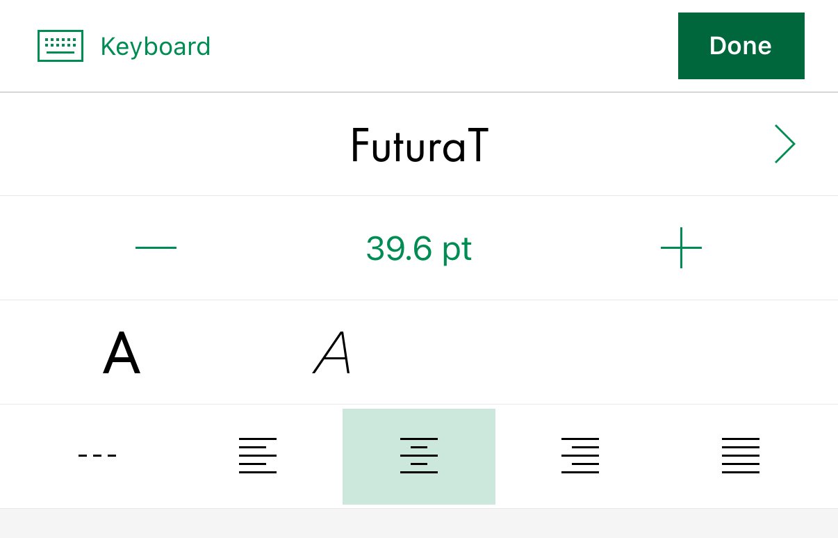
Font: FuturaT is our favorite but there are 100+ options.
Text Size: The label scales automatically.
Alignment: Centered
Capitalization: Most clients prefer ALL CAPS. The text must be typed in all caps since there is no capitalization setting.
4. Print Settings
We find it fastest to connect your label maker through your phone’s Bluetooth settings first. Then, when you’re back in the app, it will quickly pop up when you select “Confirm your P-touch connection.”
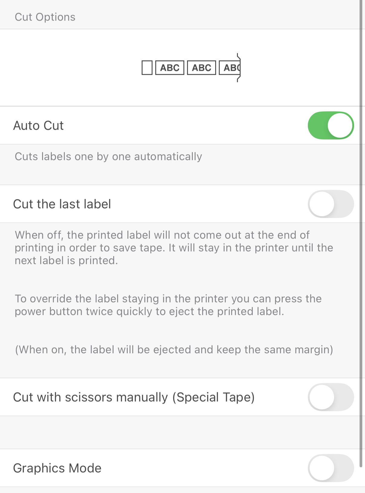
When you’re ready to print, toggle “Auto Cut” on and “Cut the last label” off. This will save tape.
Our Best Labeling Tips
Less is more.
Simple labels are easier to maintain and easier to adapt as life changes. Keep wording short, clear, and consistent throughout a space.
For example:
“Snacks” instead of “Kids After-School Snacks”
“Baking” instead of “Baking Supplies & Tools”
Labeling isn’t just about aesthetics — it’s about creating systems that actually last.
Labeling is not just about aesthetics. It creates clear homes for items so systems stay functional long after the project is finished.
Strong labeling:
Reduces decision fatigue
Helps everyone know where things belong
Prevents organized spaces from slowly unraveling
Consistent placement matters
Keeping labels at the same height instantly makes a space feel more polished and intentional.
For clear bins, we place a business card inside the bin and use it as a guide to line up each label at the same height. It is a simple trick that makes a big visual difference and keeps everything looking clean and uniform.
If you’ve been looking for a simple way to elevate your organizing systems, the Brother P-Touch Cube Plus Label Maker is one of our favorite tools.